Wednesday 22 October 2014

Photoshop Joiners

To create a joiner, you different images of the same area. Then, you upload the images onto a computer and open photoshop. Go to File>Scripts>Load Files into Stack. Click 'browse' to find the images you want to use. You must make sure you have ticked 'Attempt to Automatically Align Source Images' and click OK. Photoshop will then automatically align the images for you. 
You are then free to experiment with the different layers and also move them.
Add a new layer by going to Layer>New>Layer from Background where you can now change the colour of the background by going to Edit>Fill>Colour.
You must then flatten the image before saving by going to Layer>Flatten Image which will let you save your image as a JPEG.

Tuesday 14 October 2014

Studio Lighting and Props


 A beauty dish is a light that produces a hard light. The light can be made harder when you use a grid which directs the light into one direction rather than having a widely directed light. When you place a beauty dish close to the subject, the subject will be illuminated from different angles and this will produce less shadows. When a beauty dish is further away from the subject, more shadows are formed.


A small reflector directs the light. The light in this image has an attachment called the honeycomb grid which creates a focused beam of light with no diffusion but it is not intense. Honeycomb grids vary in size but are usually the size of a drinking straw.


A soft box is an attachment for the studio lights that softens the light. The soft box is there to evenly light the subject, thus creating an evenly lit image.

Wednesday 8 October 2014

Manual Camera Handling

I have been experimenting with the camera settings to see if I can get a perfectly exposed picture. I had been changing the shutter speed, aperture and the ISO on the camera to see how much of a difference each setting makes on the brightness of the entire image.

Changing the Shutter Speed
Changing the shutter speed seemed to change the exposure of the image quite a lot because of how quick the shutter opens and closes. When the shutter is open, light is let in, so when the shutter speed is slow you are letting more light into the image. So I decided to use 1/60, 1/100 and 1/250.

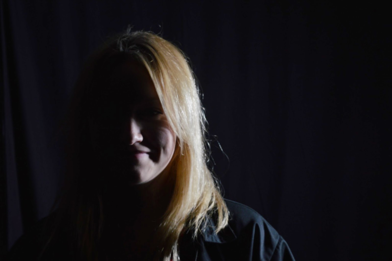
This image was taken with a shutter speed of 1/250. Due to the fast shutter speed, this image is rather under exposed because there are too many shadows and the white background isn't even white.

This image was taken with a shutter speed of 1/100. This image seems to be more correctly exposed than the other two I had taken.

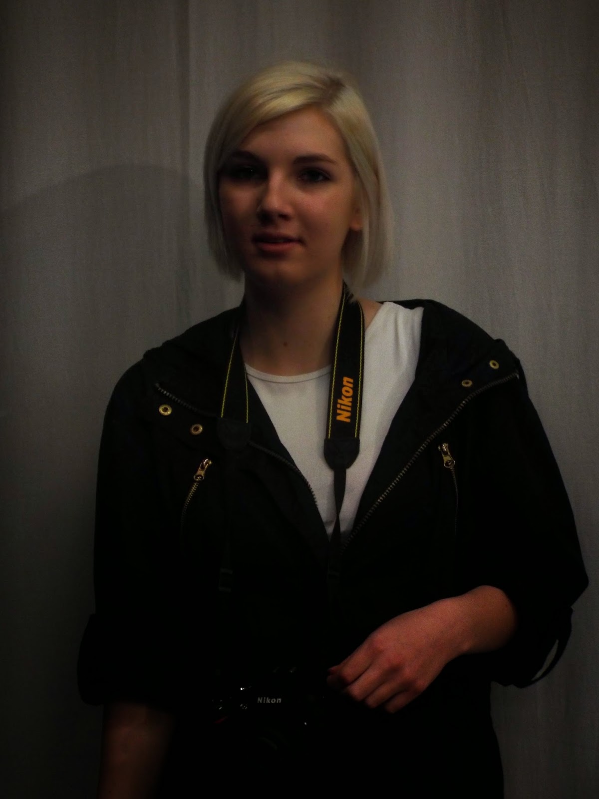
This image was taken with a shutter speed of 1/60. Due to the long shutter speed, more light was able to get through the lens making this image over exposed.


Changing the Aperture
Changing the aperture changed the exposure of the image slightly. The aperture controls how much light goes through the lens and is measured by f-stops. The smaller the number, the bigger the hole. I chose to use f 2.8, f 8 and f11.

This image was taken with an aperture of f 11. This is the smallest aperture I used and the image is under exposed due to the lack of light let in to the lens.

This image was taken with an aperture of f 2.8. This image is rather over exposed because the aperture setting let in too much light.

This image was taken with an aperture of f 8. This is a correctly exposed image as the aperture was at the correct size.


Changing the ISO
The ISO has a greater part in the exposure of images because the ISO controls the light sensitivity. A low ISO, such as 100, will be less sensitive to light than a high ISO, such as 800. The ISO's I used for this experiment are 100, 800, and 3200. 

This image was taken with an ISO of 100. Due to the ISO being low, it did not pick up much light so this image is under exposed.

This image was taken with an ISO of 800. This ISO helped me achieve a correctly exposed picture.

This image was taken with an ISO of 3200. The high ISO made the image over exposed.


Friday 3 October 2014

Photographic Styles

Documentary Photography
Documentary photography is used to capture both significant and historical events. It is usually covered in photojournalism. The aim of this kind of photography is to produce truthful, objective and candid photographs of a particular subject. An example of a documentary photographer is Dorothea Lange who's famous for the 'Migrant Mother' image which was taken during the Great Depression.


Still Life Photography
Still life photography is the capture of inanimate objects, or usually a small grouping of objects. Still life photography gives the photographer more leeway with the arrangement of the elements in the image. This genre of photography requires compositional skills and a refined sense of lighting.


Panoramic Photography 
On some cameras, there is a Panorama mode which allows you to take a picture whilst panning the camera either horizontally or vertically to create an image with a wide field of view. This genre of photography is best for landscapes.


Portrait Photography
Portraiture is based on people. The photographs are usually of a person or group of people that displays expression, personality or mood. The main focus of portraiture is a person's face so the photographs usually contain the head and torso of a person; but on occasions, photographers will include the entire person in the photograph.


Landscape Photography
Landscape photography is typically the capture of the world; this includes nature and man made features. Many landscape photographs show little or no human activity. Landscape photography can be there to bring out the greatness of nature such as mountains or an open field.


Wednesday 1 October 2014

Re-Touching

I have been given an image to retouch to make it look better. I will be using Photoshop to edit this image. I will use three tools; the spot healing brush, the healing brush and the patch tool.
To begin with, I decided to use the 'spot healing brush' to get rid of any visible spots and freckles, this made her skin look clean and smooth.


I then decided to clean up the scar under her lip and the small spot scars on her cheek to make her skin more clear using the 'healing brush', I also got rid of any loose strands of hair near her cheek.


Whilst I was fixing up her scars, I decided to get rid of any unwanted hair near her eyebrows and I also got rid of her wrinkles under her eyes to make her look younger.

Angles, Viewpoint and Cropping

Edgar Degas
Degas is a famous artist from France. He is well known for his paintings, sculptures, printmaking and drawings. He is known as an impressionist or a realist. His artwork is inspired by photography; where the artwork captures real life instead of perfection.
Before photography became known, artists would create drawings that are very perfect; but once Degas discovered photography, he changed his style completely and based his artwork on the sorts of images photographers would capture; reality. Photography was able to capture movements which gave the images more of a reality-like feel to them; Degas took that and created paintings that looked more realistic.


There is a rather clear difference between these two paintings. The painting of the jockeys and the horses looks more realistic because it captures a real life moment. Due to the horses moving out of the painting, it can show movement and reality. There is also a lot of open space in this painting.
However, his painting of the ballet dancers looks staged; it doesn't look natural. This painting is more brightly coloured than the painting of the horses.

Early Kodak Photographs
The early Kodak photographs were circular. Using the camera, which was named Kodak No1, you would have to set the shutter by pulling a string and pressing the button on the side of the camera. After the photo had been taken, you would then wind the key to reset the film. Normal people who were taking photographs with the cameras were known as 'amateurs'; this is because photographers would look at their work and criticize it because the 'amateur' photographs would crop people or their compositions were terrible.


Two examples of photographs taken with the Kodak No1.


Camera Angles, Viewpoint and Cropping
I went around the college campus and too some photographs focusing on different angles, viewpoint and cropping.

The first photograph I took was looking up at some people on a balcony inside one of the campus buildings. I like how this image looks because the people are looking down and it makes them seem like giants. The image is quite plain but it shows you the main focus of the image.


The second photograph I took was looking up at the branches and leaves of trees. But when looking at the photograph, I didn't like how it turned out, so I decided to try again. The second attempt looks totally different because I decided to take a picture looking up at the branches from the trunk of the tree. I'm glad I decided to take a second attempt because there is a higher range of colour and it represents a camera angle.


For my third picture, I decided to get one of my friends to be in the shot. This is an example of cropping because I chose my friend to be in the centre of the image so I cropped out some of the background. I think this image can be improved a lot because there are other people in the background and it's not very obviously cropped.


My final image is of one of the campus buildings. This is a mixture of camera angle and cropping because I cropped out a lot of the building but I put the camera on an angle which makes the building look like it is sort of sinking.

Tuesday 30 September 2014

High Key and Low Key

High Key Lighting
High Key lighting is a style of lighting that makes the photographs free from shadows. A disadvantage to high key lighting is that it doesn't add any meaning or drama to the photographs; instead it makes the photographs seem calm and relaxed due to the lack of shadow. I went into the studio and decided to use the high key lighting for some photographs; the photographs appear to have no shadows which is because of the positions of the lights, and I also used props to make the photographs seem a little more interesting and to add some colour.


Low Key Lighting
Low key lighting is completely different from high key lighting. This is because low key lighting adds shadows to the pictures which can give the images more of a mysterious feel, whereas high key lighting includes little to no shadow. I also used low key lighting when I went into the studio and I placed the light to the side of the person modeling, this made the light only shine on half of their face and their other half of their face was in the dark which made the model seem mysterious.


Wednesday 24 September 2014

Shutter Speed Activity

Experiment One: Camera Shake
For the camera shake, I had to take pictures in the corridors and outside; I set the camera to the shutter priority setting and changed the shutter speed so that it was slow, for example 1/30th second. When I was taking the photo, I had to shake the camera which created a blur. I then changed the shutter speed so I could take a sharp image whilst shaking my camera. The images I took turned out to be rather successful because the ones taken with a slow shutter speed are rather blurred but the ones I took with a fast shutter speed are sharp.


Experiment Two: Abstract Motion Blur
For the abstract motion blur, I took pictures indoors with the camera on shutter priority. I set the shutter speed to 1/8th second. There were four stages of this experiment. The first stage was to take a picture of someone whilst I zoom the lens. The second was to take a picture of someone whilst I rotate the camera. The third was to take a picture of someone whilst I shake the camera. And the fourth stage was to take a picture of someone whilst I rotate the camera and zoom the lens. My images were successful because they created four different kinds of blurs.


Experiment Three: Light Writing and Painting
Light writing and painting required a dark room so I used the studio. For this I had to set the camera to the manual setting with the shutter speed on the Bulb setting and the aperture on f8. I turned off the lights and used the flashlight on my phone to write my name and the names of the people I worked with. My images for this were successful because the room is completely dark and you can quite clearly read my name from the light. The only difficult thing with light writing is that you need to know how to write words backwards, but if not, you can easily flip the image when you upload it to a computer.


Experiment Four: Ghosts
For the ghosts experiment, I needed to be inside. I had to set the camera to shutter priority with a shutter speed ranging from 4-8 seconds. This experiment required a tripod because the camera needed to be very still. This experiment also had four stages. The first stage was to take a photograph of someone who rushes out of the shot half way through the exposure. The second stage was to repeat the first stage but with a different shutter speed. The third was to make the person seem more transparent. And the fourth stage was to make the person less transparent. My photos seem to be successful because the people in the photographs seem to look like ghosts.


Experiment Five: Frozen Motion
Frozen motion required being outdoors. I had to set the shutter speed to a fast shutter speed so I used 1/500th second with an ISO of 400. The first photo I took for this was of someone jumping, but because of the fast shutter speed, the motion was frozen. The second photo I took was of someone running, and again the motion was frozen. The third time, I changed the shutter speed to a slower one so the running person created a motion blur. My photos are rather successful because the first two are sharp and the motion is frozen, but the second one is more blurred but everything in the background is slightly sharp.


Experiment Six: Panning
For the final experiment, I needed to set the camera to shutter priority with a shutter speed of 1/30th second. For this, I needed to take a photograph of someone running, but instead of keeping the camera still, I needed to follow the motion. This creates a sharp motion but a blurred background to show that there is movement in the photo. My photo seems to be successful but I think I could've found a way to make the movement sharper than it is.

Wednesday 17 September 2014

Compositions

Rule of Thirds

The rule of thirds rule is where an image is divided up by two vertical lines and two horizontal lines which creates three columns and three rows. The lines are there to make your photographs look more aligned because you place the important elements on or near the guidelines. The rule of thirds is there to make your photographs look well balanced and therefore at rest.


Leading Lines
Leading lines are lines within the image that leads the eye to another point in the image. Anything with a definite line can lead the eye to somewhere in the photograph; for example fences or train tracks. Leading lines are a great way to create somewhat relationships between the frames of the shot, the subject matter and there space.


Even and Odd
This rule suggests that an odd number of subjects in the photograph appear more intriguing than an even number. An even number of subjects in a photograph creates symmetry which can make the image as a whole less enthralling. The odd numbers of subjects can make the photograph look more 'attractive' and can also draw viewers to them.


Triangle Rule 
The triangle rule is a great composition technique. They usually work best when you have three main subjects. The best part about this rule is the balance it gives to the viewer, and it can fill the frame rather nicely. Sometimes the triangles created are intentional and other times they can be created by accident.


Leading Room and Space

Leading room (and space) is an important technique because altering the lead room can also mood or feeling of a photograph. Lead room is the space in front of moving or stationary objects.